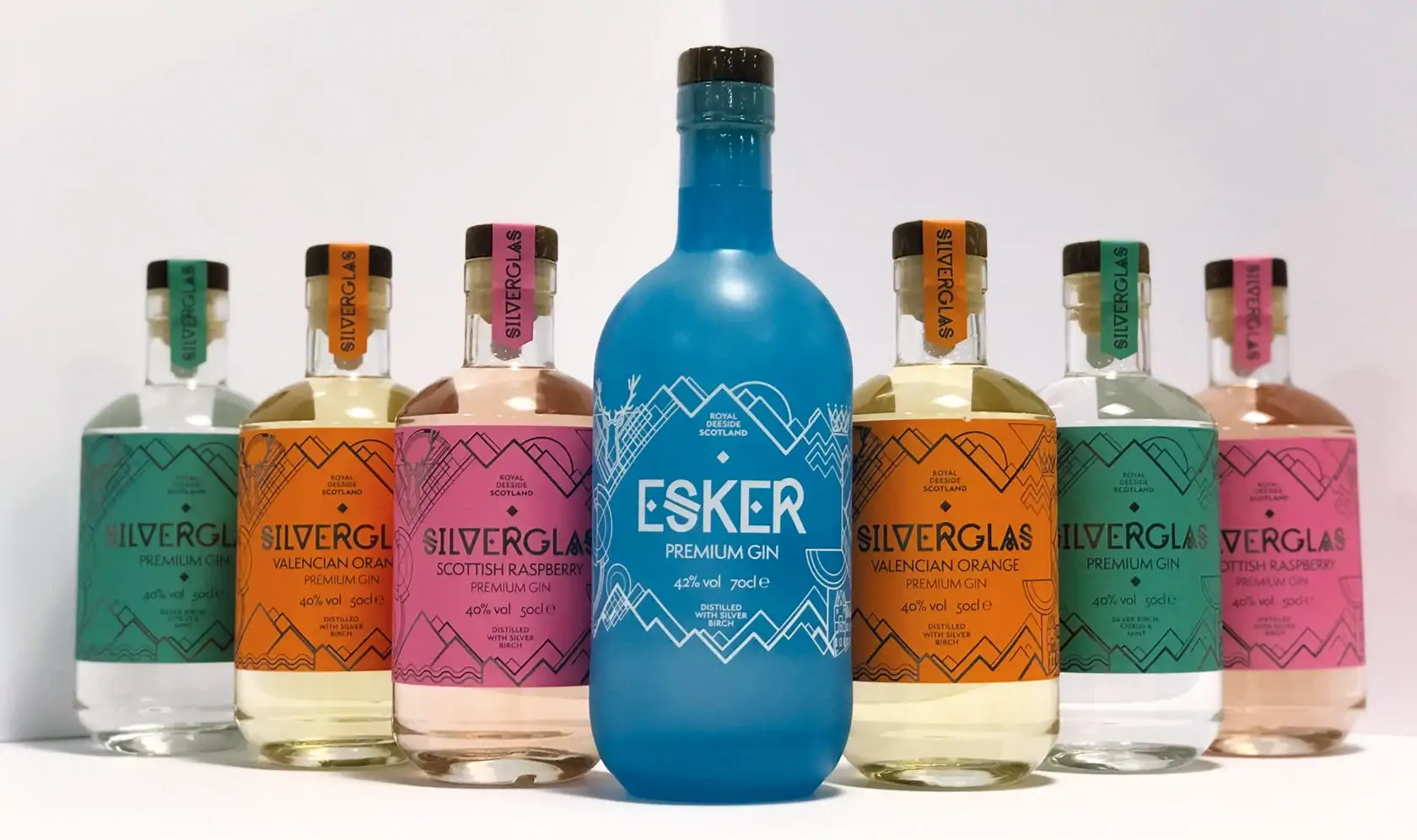
Solution
We developed a new brand identity for Esker, and rolled this out across digital and offline brand materials.
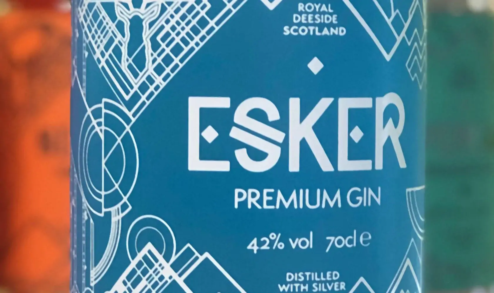
Making use of a distinctive letter ‘S’ at the core of the new brand mark represents a simplified esker, while the colour palette is restrained and simple - a cool, almost glacier-blue; and silver-grey (a nod to the birch).
Around the core mark are graphic references to the local landscape – mountains, rivers and ancient castles… even contour lines of the esker.
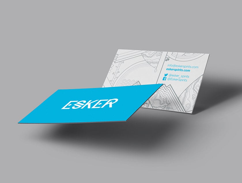
The elements have been brought together to create a distinctive brand pattern that goes on to form the backdrop for company stationery, corporate literature and promotional banners.
Results
Esker has a new brand identity that reflects its spirits and the local area that influences them, with a modern look and a nod to tradition and Esker's Scottish heritage.
The mountains, the River Dee, topography, castles, juniper berries, and silver birch – they’re all there along with a hint of plaid.
The intricate design on the bottle shows off the clarity of the spirits and hints at the crisp, clear water of the River Dee which reaches the Esker distillery after being filtered through the Cairngorm Mountains.
It doesn’t get much fresher.
The company started with Esker, their original London Dry gin. When they saw how well it was received, they launched Esker Gold, and then Silverglas. Their Esker Vodkas have extended the range.
Taking new products to market and diversifying the offering is ensuring that Esker remains relevant and stand-out in the market - especially with its strong design aesthetic.